Cargill: Salt & Sear Restaurant-Quality Beef
Crafting a beef brand that signals restaurant quality at home.

Cargill wanted to introduce a new, premium brand of top-tier Choice steaks and roasts. Sounds simple enough – but getting retailers to carry a new brand with little to no awareness? Not so much. Convincing retailers to jump on board would take smart positioning, along with branding that’s worth its salt.
To develop a beef brand that resonates with shoppers and retailers alike, we turned to Cargill’s proprietary consumer research.
The data told us that restaurant-quality beef is a product consumers crave.
However, after an audit of the marketplace, Cargill discovered there were no beef brands with a “restaurant-quality” positioning.
With those insights, we brought the steakhouse to the consumer’s house with Salt & Sear Restaurant-Quality Beef: a brand consumers were asking for – and a unique positioning to help retailers fill an unmet need.


Premium positioning
Knowing there was an unmet desire for restaurant-quality beef at home, we set out to create a brand that represents just that. At the same time, we would hero the consumer as a great chef to position the brand as a category illuminator and expert.
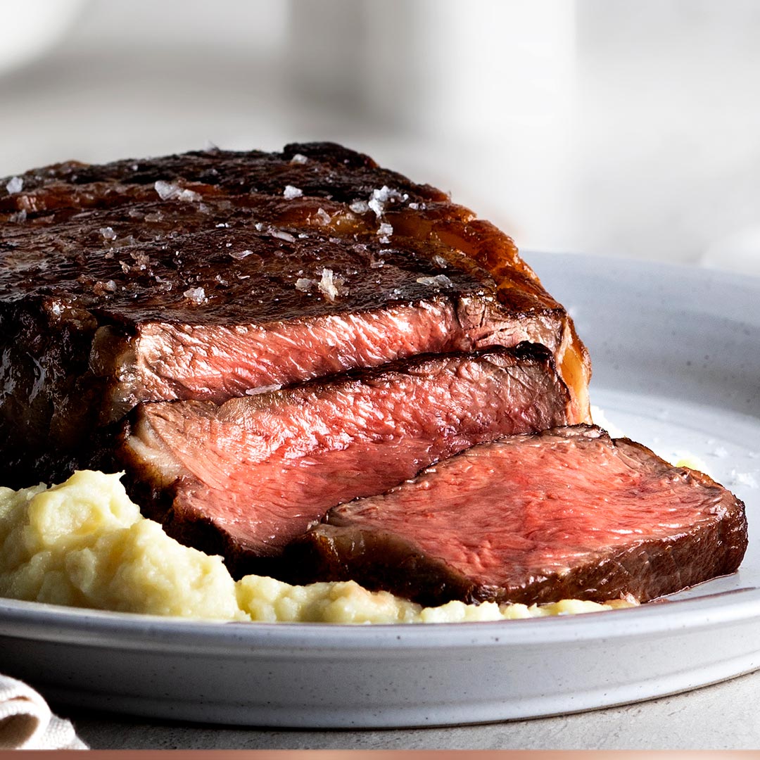

An appetizing name
Ask a chef the key to tender, flavorful and just plain perfect beef, and their answer might surprise you.
It’s not a spice. It’s not a marinade. It’s not high-end equipment.
It’s in the quality of the beef, along with a generous amount of salt and a nice sear.
Which, after several rounds of brainstorming, led us to Salt & Sear Restaurant-Quality Beef.
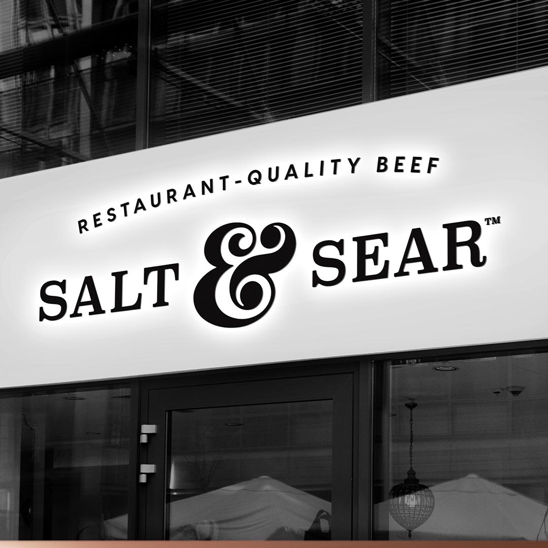

A steakhouse-worthy logo
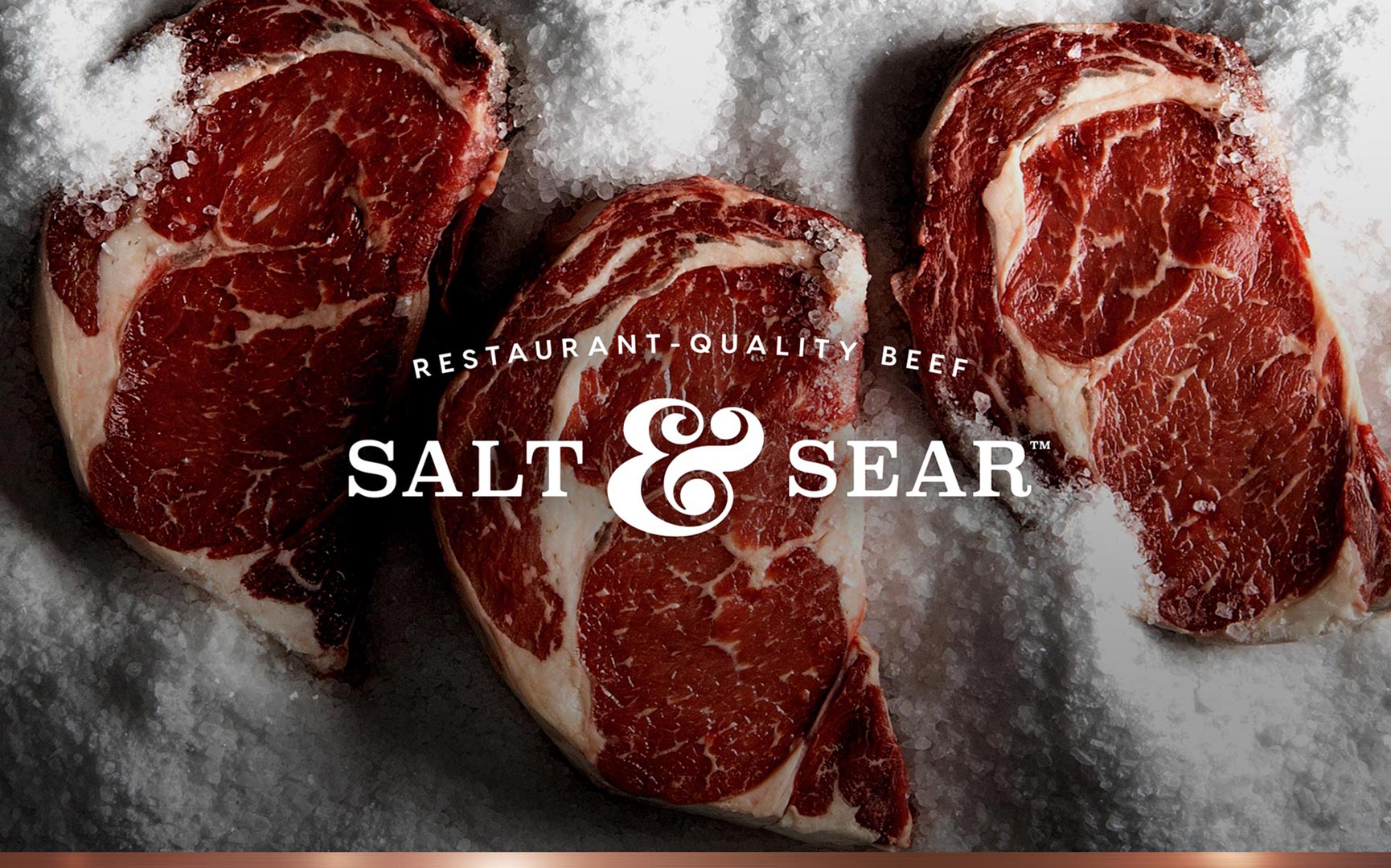
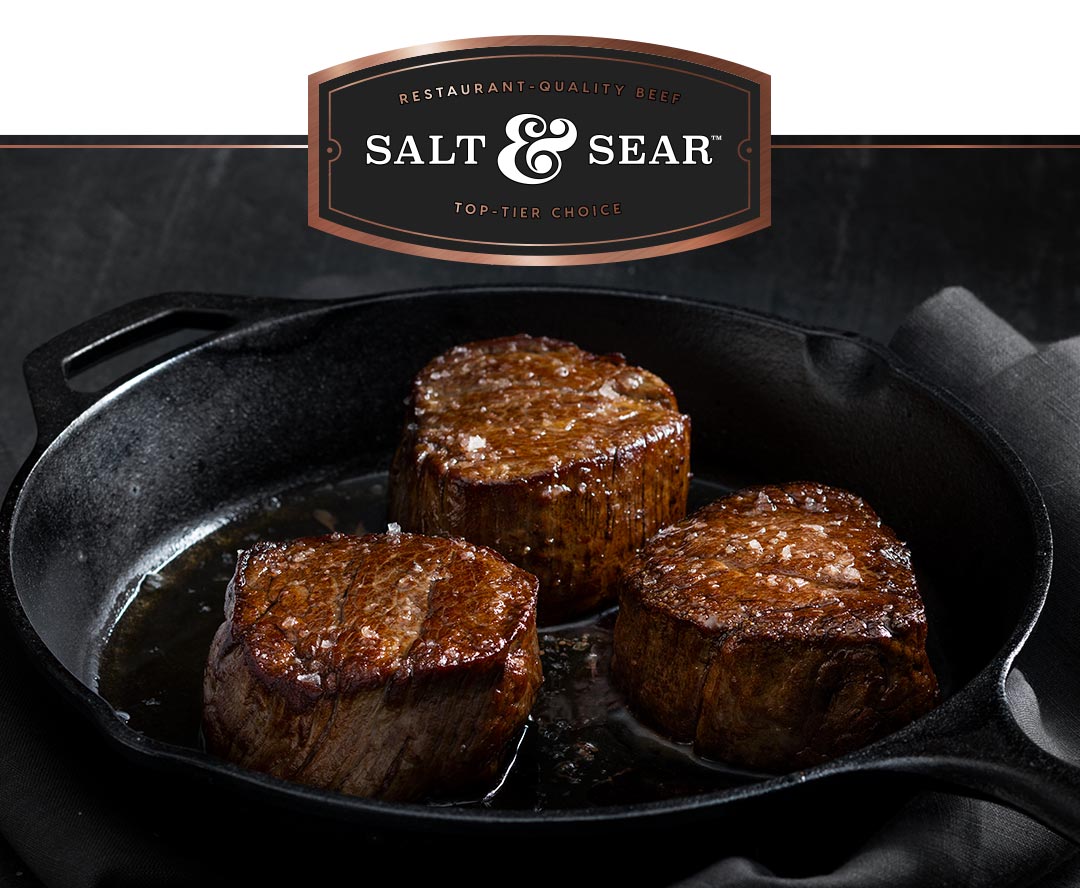
The logo’s sophisticated serif typography and elegant script ampersand evoke premium quality.
In designing the logo, we knew it needed to look in place on a steakhouse. So we mocked it up on a building. To our delight, the logo looked right at home on a storefront.
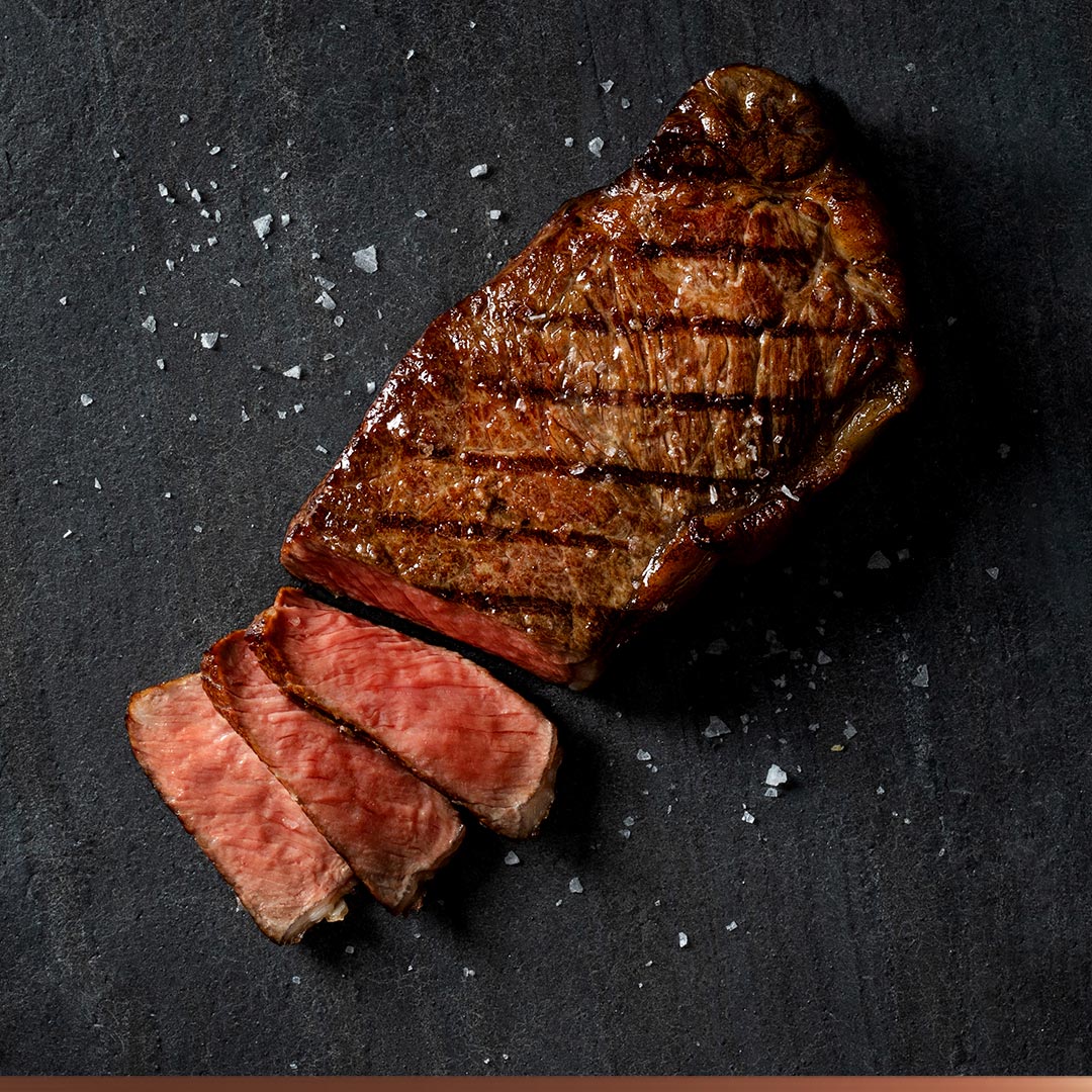

A premium look and feel
The brand’s look and feel channels the dramatic, dark, moody ambiance of an upscale steakhouse.
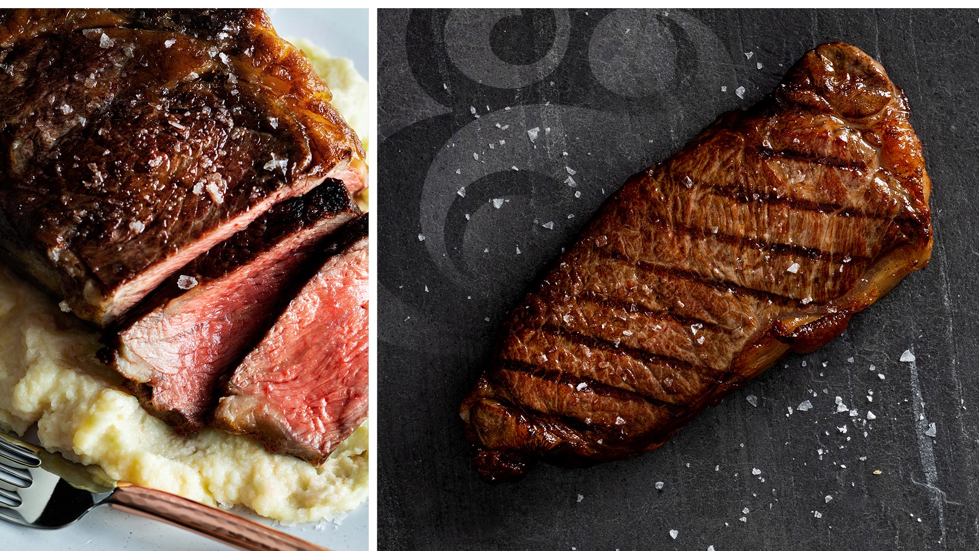
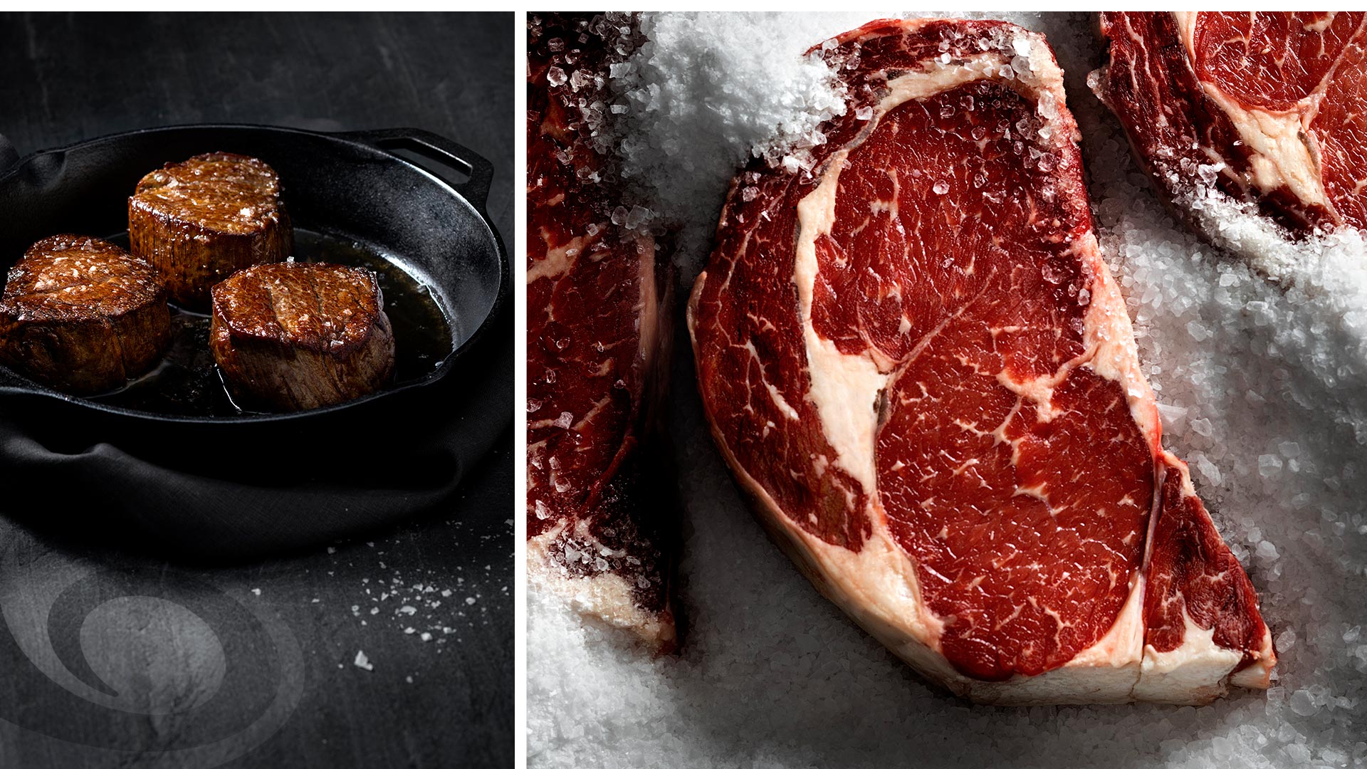
We incorporated high-end surfaces, including slate and marble, into our brand materials. And we captured mouthwatering photography using a dramatic-yet-minimalist aesthetic to draw attention to the beef.
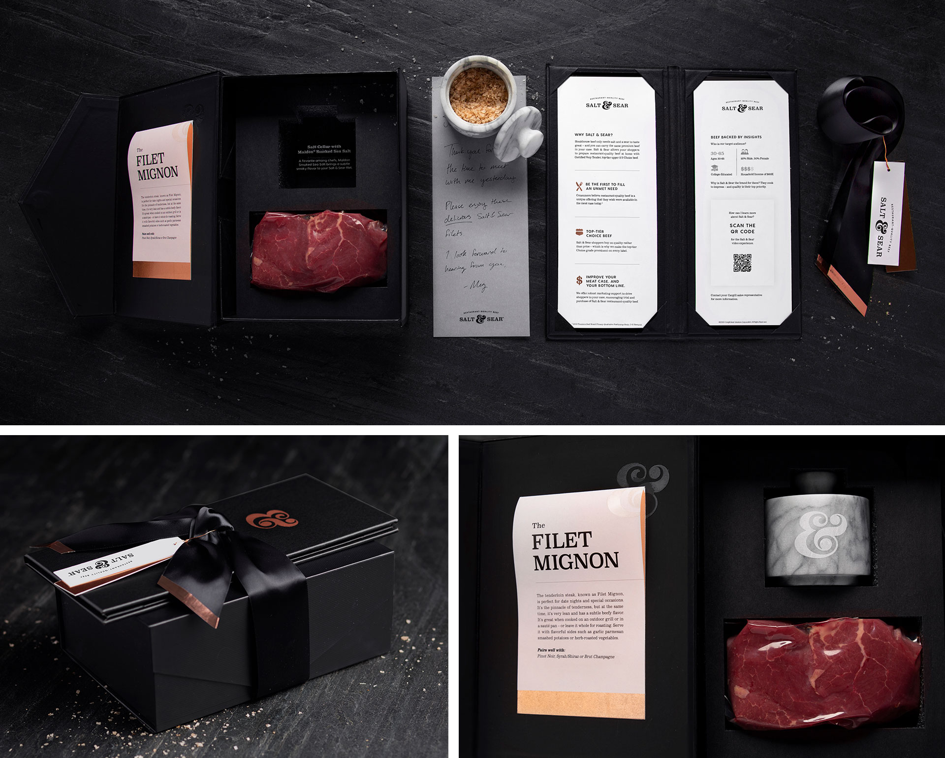

Serving a five-star first impression
To give potential retail customers a taste of the brand, we assembled hand-crafted gift boxes for Cargill to give out at sales meetings.
Each box included a custom Salt & Sear “menu” with product attributes and consumer insights supporting the brand. Menus included a custom QR code to track sales leads and increase measurability.
The boxes also came with two Salt & Sear filets, along with custom-engraved white marble salt cellars. All introduced with a personal note from their Cargill contact, tucked inside the menu.
Extending the experience to the web
With Salt & Sear Restaurant-Quality Beef still in its infancy, we created a website to help legitimize the brand and build awareness. The website includes a brand overview, a store locator and chef-inspired tips to help introduce Salt & Sear Restaurant-Quality Beef to consumers.
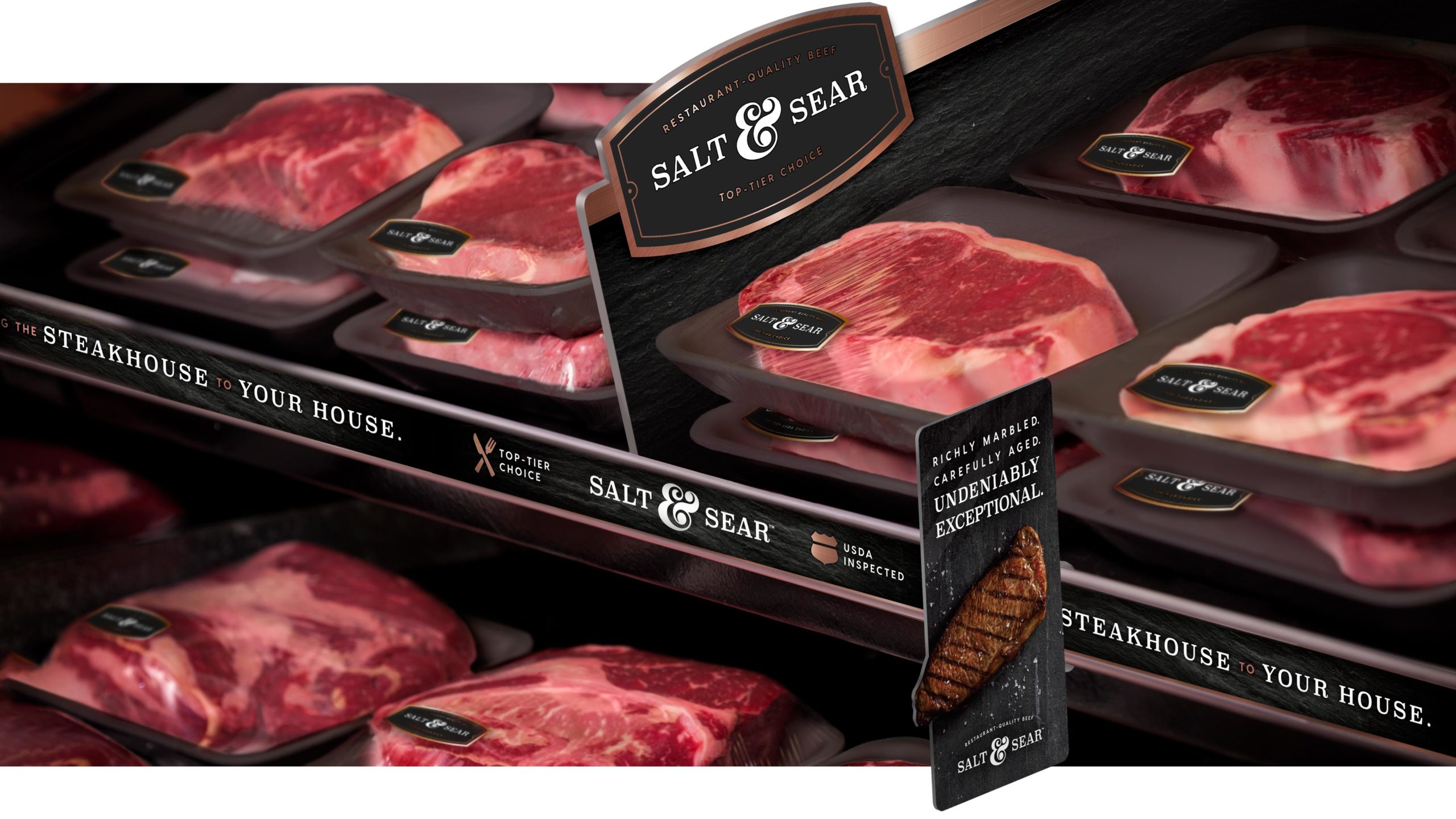

Bringing the brand to life at the case
We extended the brand to the meat case with a unique visual system that has enticing shelf appeal and strong recall.
Carried in more than 250 grocery stores along the east coast.
